

Supply Chain KPI Dashboard
Unlock real-time visibility into delivery cost, pallet efficiency, and shipment performance.

Reduce Shipping Costs
Track shipment cost per device, pallet fill percentage, and route efficiency instantly.
Why Supply Chain Visibility Matters

Improve Supplier Management
We turn your raw data into clear dashboards, reports, and insights so you can spot trends, understand performance, and make confident decisions.

Make Data-Driven Decisions
We build tools and automations that handle repetitive processes for you, reducing errors and freeing up your time to focus on what actually matters.
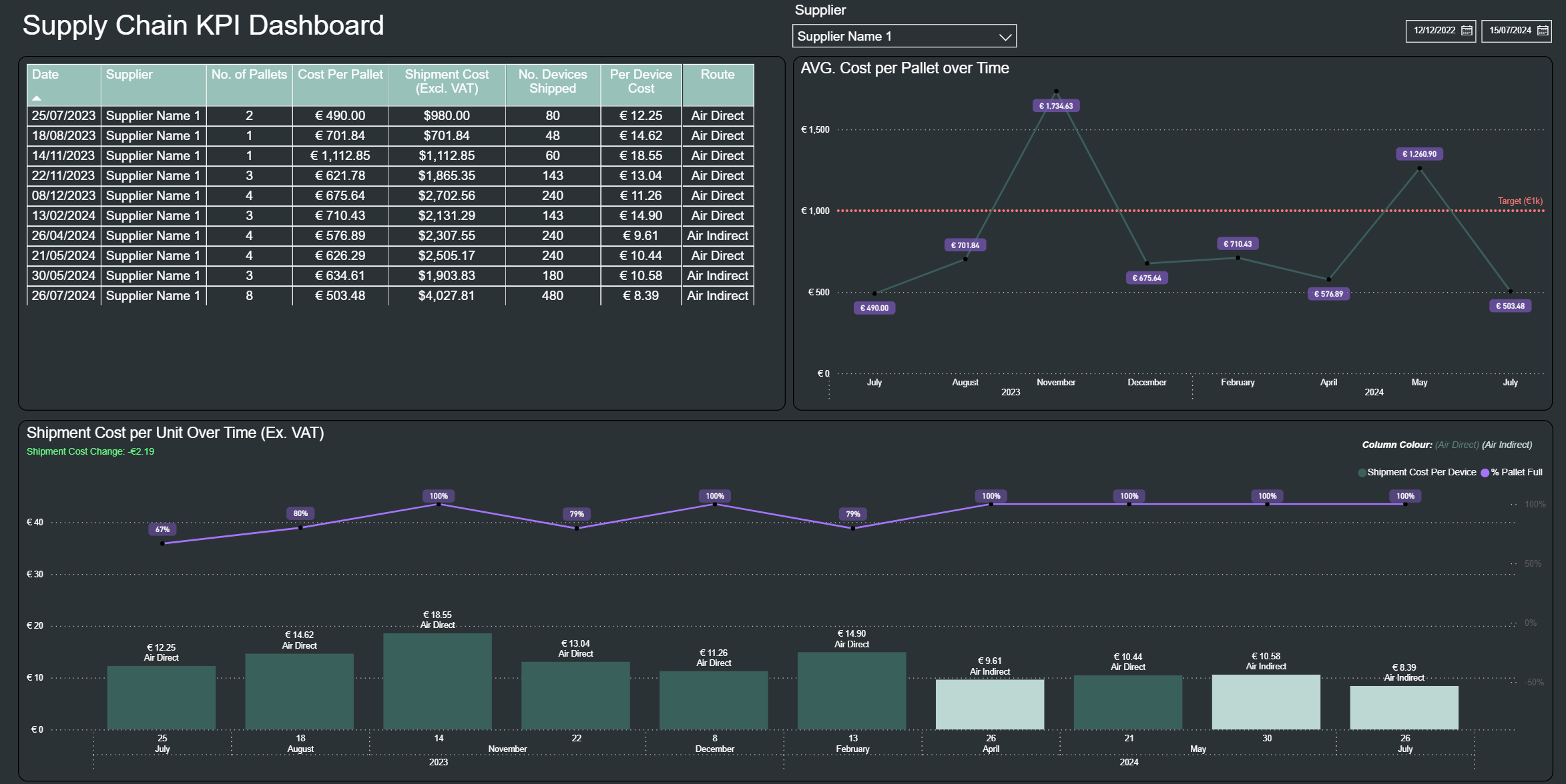
Supply Chain Dashboard Preview
A real example of how D³ helps companies understand delivery cost trends, pallet utilisation, shipment efficiency, and supplier performance in seconds.


Real-Time Updates Automatic data refresh so KPIs are always accurate.
Drill-Down Capability Click to isolate suppliers, routes, months, or cost components.
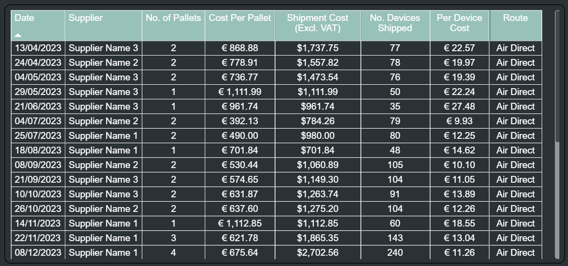
Custom Thresholds Highlight target lines (e.g., €1k per pallet) with automated alerts.
Beautiful Visuals Clean and interactive charts built for quick decision-making.
Export to Excel Export filtered data instantly for external reporting.
Inside the Dashboard: What Each Visual Shows
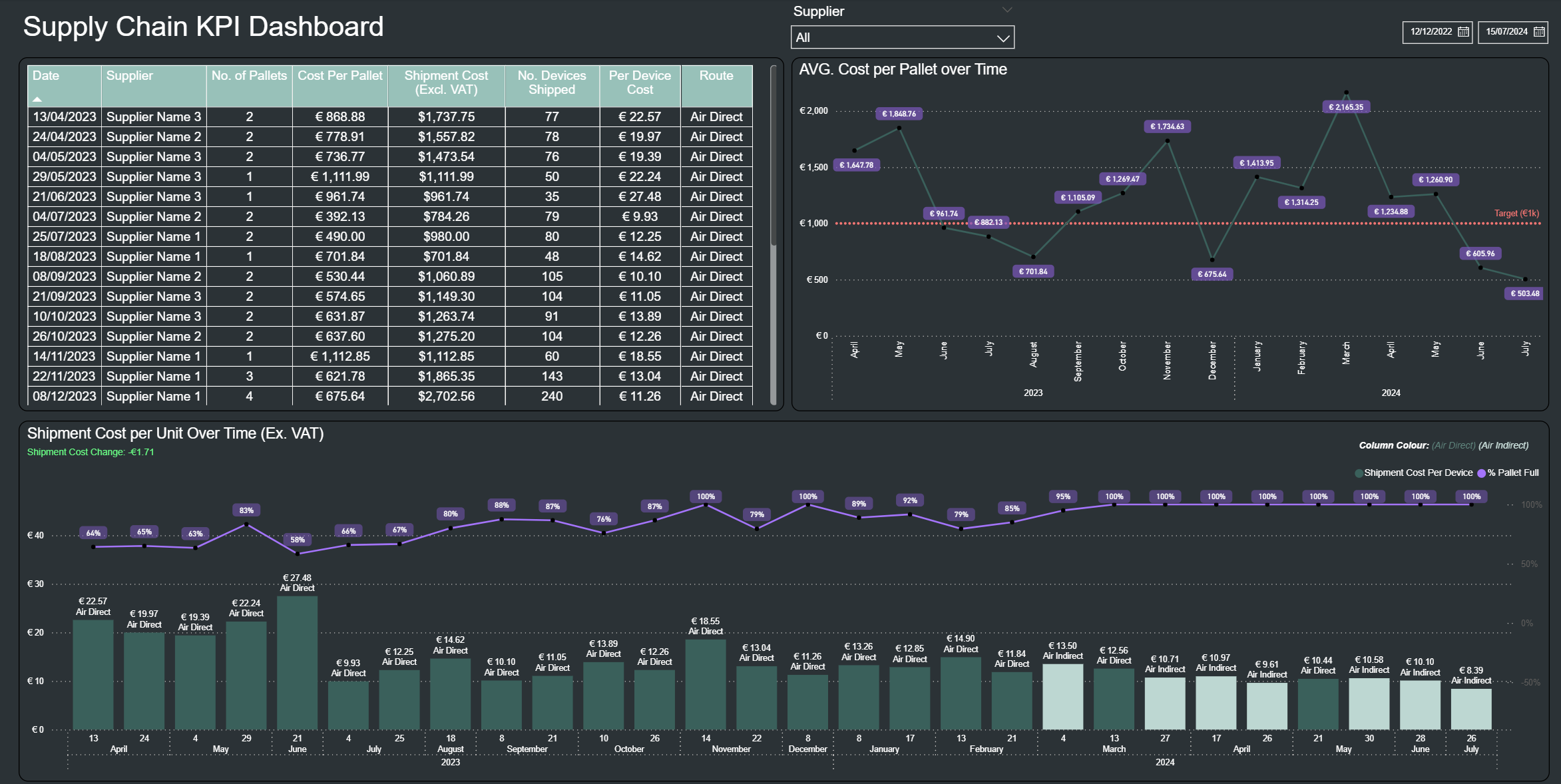
1. Shipment Data Table
This is the full log of every shipment.
It shows the supplier, pallets sent, shipment cost, devices shipped, and the cost per device.
It’s the foundation for understanding where your costs come from and how efficient each shipment was.
3. Shipment Cost per Unit Over Time
These controls allow you to instantly filter the entire dashboard by:
Specific supplier
Custom date range
Every visual updates automatically, helping you compare supplier performance or focus on a specific time window.
2. Average Cost per Pallet Over Time
This line chart shows how the average pallet cost has changed month-to-month.
It highlights expensive periods, improvements, and how performance compares against your target pallet cost (shown by the dotted line).
A quick way to answer:
“Are we paying more or less per pallet over time?”
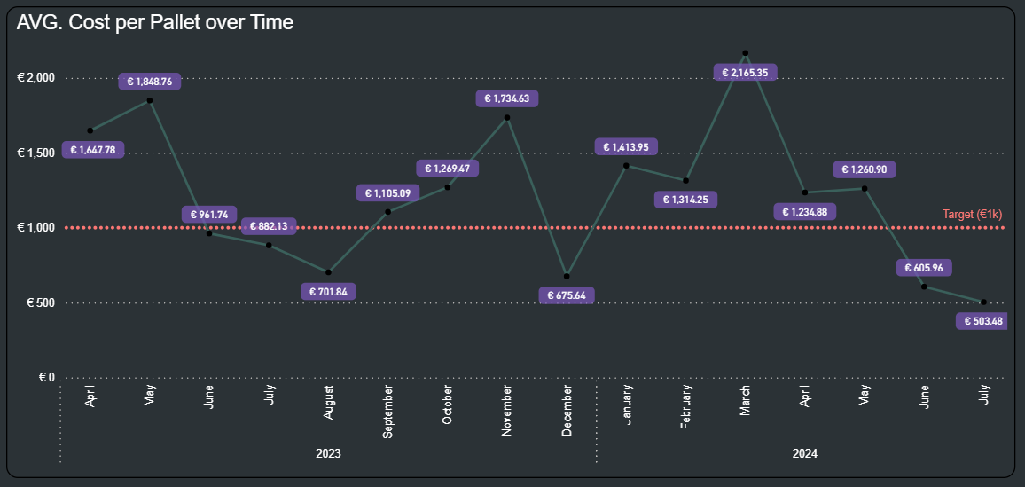
Bars – Cost per Device Shows how much each individual shipment costs per device shipped.
Useful for identifying expensive shipments, comparing routes, and spotting unusual spikes.
Line – % Pallet Full Shows how efficiently space was used in each shipment.
High percentages mean highly efficient, fully utilised pallets.
Low percentages highlight wasted capacity that increases per-device cost.
Subtitle – Cost change between last two shipments
Green = cost decreased (good)
Red = cost increased
White = no major change
A quick directional indicator of performance.
4. Supplier & Date Filters
Reduction in Shipping Costs
Businesses that track shipment-level cost drivers (like pallet fill and route type) typically cut operational shipping costs by 12–22% through optimisation and elimination of waste.
What This Means for Your Business

Visibility Across All Shipments
With shipment costs, pallet efficiency, and route performance all in one dashboard, you can make informed decisions that directly improve your bottom line.

Less Time Spent on Weekly Reporting
Automated dashboards reduce manual Excel work dramatically, saving teams 4–8 hours per week.